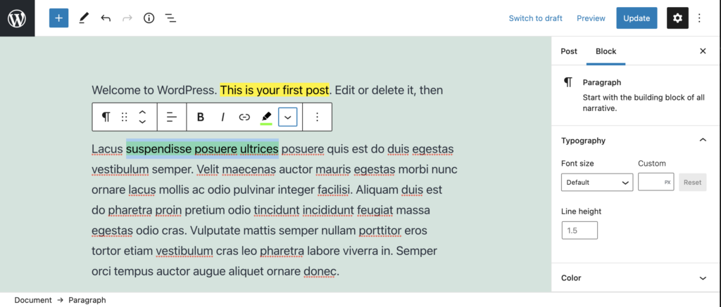
We have had a look at Applying Formats to your Post Content with registerFormatType. But what if we want to add additional colours to our highlighter pen?
In this guide we are going to expand what we worked on previously and add a modal popup that will allow us to select a highlight colour.
Note that in this modal popup could contain any number of items, including custom icons, images or even form fields.
All of the code used in this tutorial can be found in the free ‘Highlighter’ plugin.
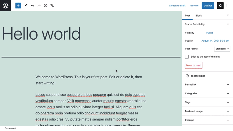
Applying a format type using the Highlighter plugin.
The video above shows the Highlighter plugin, our format type and the popup in action. Let’s jump to it.
Prerequisites
- Read the Creating a Plugin for the WordPress Block Editor (Gutenberg) guide so you can get a head start in creating the plugin.
- Follow the steps in the Format your Post Content with registerFormatType article.
- Optionally download the free ‘Highlighter’ plugin from GitHub, and look at the file
/src/formats/highlight-colours.js
Create the Modal
To create the modal popover, we are going to use state, to determine if the button has been clicked or not. To do this import useState from '@wordpress/element'.
Within the button component, above the return statement, we are going to use this to set an initial state, and create our state setter functions.
 // State to show popover.
 const [ showPopover, setShowPopover ] = useState( false );
We are then going to alter the click event of the button to set the state.
onClick={ () => {
    setShowPopover( true );
} }
Now that the state is set, we can use this to trigger the popover. First import the URLPopover component from '@wordpress/block-editor'. Then within the return statement, under the button, add a conditional that takes the showPopover variable and renders the URLPopover.
return (
  <>
    <RichTextToolbarButton
      icon='edit'
      onClick={ () => {
        setShowPopover( true );
      } }
      title={ __( 'Highlight', 'wholesome-highlighter' ) }
      />
    { showPopover && (
      <URLPopover
        className="components-inline-color-popover"
        onClose={ () => setShowPopover( false ) }
        >
        ...
      </URLPopover>
    ) }
    </>
)
Note that we have wrapped the two components with empty tags <></>. These serve the purpose of the <Fragment> tag, and allow two JSX components to render without outputting markup on the frontend.
Add the Modal Popover Content
Because this is a highlighter plugin, we are going to import ColorPalette from '@wordpress/block-editor' and place this into the modal popover.
<URLPopover
   className="components-inline-color-popover"
   onClose={ () => setShowPopover( false ) }
 >
 <ColorPalette
    onChange={ ( color ) => {
      setShowPopover( false );
      if ( color ) {
        onChange(
          applyFormat( value, {
            type: name,
            attributes: { style: `background-color: ${color};` },
          }
        ));
      } else {
        onChange( toggleFormat( value, { type: name } ) ); // Remove Format.
      }
    } }
    />
</URLPopover>
The above code will use the default colour palette in the popover. More work will be needed to add our custom colours.
The Code in Full
To demonstrate how we add custom colours to the palette, it is probably best to show the full code. You can also download this file, along with the latest updates from Github.
/**
 * Highlighter Colours.
 *
 * Highlighter with a colour selector popover.
 */

// Import WordPress Components.
import { ColorPalette, RichTextToolbarButton, URLPopover } from '@wordpress/block-editor';
import { useState } from '@wordpress/element';
import { __ } from '@wordpress/i18n';
import { Icon } from '@wordpress/icons';
import { applyFormat, registerFormatType, toggleFormat, useAnchorRef } from '@wordpress/rich-text';

// Import Styles.
import '../style.scss';

const name = 'wholesome/highlighter';
const cssClass = 'wholesome-highlight';

// Create Highlighter Button with Colour Selection Popover.
const HighlighterButton = ( props ) => {
    const { contentRef, isActive, onChange, value } = props;
    const { activeFormats } = value;
    const anchorRef = useAnchorRef( { ref: contentRef, value } );

    // Custom Icon SVG.
    const highlighterIcon = <svg width="20" height="20" viewBox="0 0 20 20" fill="none" xmlns="http://www.w3.org/2000/svg">
        <path d="M14.2186 3.31061C13.7838 2.89252 13.0834 2.89708 12.6543 3.32078L9.22512 6.70711C9.17494 6.75668 9.13068 6.80978 9.09236 6.86558L7.36613 8.57021L11.393 12.4419L16.362 7.50771L16.6812 7.1925C17.1103 6.76879 17.1056 6.08638 16.6708 5.66828L14.2186 3.31061Z" fill="black"/>
        <path d="M6.81914 9.10588L10.8041 12.9457L9.79592 13.9391C9.42424 14.3053 8.84982 14.3575 8.42039 14.0938L7.83675 13.8883L7.01822 14.6819L5.03321 12.7381L5.86163 11.9349L5.67624 11.454C5.39121 11.0373 5.43547 10.4692 5.811 10.0992L6.81914 9.10588Z" fill="black"/>
        <path d="M5.11329 13.6189L6.13911 14.5945L5.70907 15L4 14.592L5.11329 13.6189Z" fill="black"/>
    </svg>;

    // State to show popover.
    const [ showPopover, setShowPopover ] = useState( false );
    const [ activeColor, setActiveColor ] = useState( false );

    // Custom highlighter colours.
    const colors = [
        { name: 'Yellow', color: '#fff300' },
        { name: 'Green', color: '#79fe0c' },
        { name: 'Blue', color: '#4af1f2' },
        { name: 'Purple', color: '#df00ff' },
        { name: 'Red', color: '#ff2226' },
        { name: 'Orange', color: '#ff7b19' },
        { name: 'Pink', color: '#ff70c5' },
    ];

    // Function to get active colour from format.
    const getActiveColor = () => {
        const formats = activeFormats.filter( format => name === format['type'] );

        if ( formats.length > 0 ) {
            const format = formats[0];
            const { attributes, unregisteredAttributes } = format;

            let atts = unregisteredAttributes;

            if ( attributes && attributes.length ) {
                atts = attributes;
            }

            // If we have no attributes, use the active colour.
            if ( ! atts ) {
                if ( activeColor ) {
                    return { backgroundColor: activeColor };
                }
                return;
            }

            if ( atts.hasOwnProperty('class') ) {
                // If the format has set a colour via the class.
                const parts = atts.class.split( '--' );
                const colorName = parts[ parts.length - 1 ];
                const selectedColor = colors.filter( item => colorName === item.name.toLowerCase() )[0];
                return { backgroundColor: selectedColor.color };
            } else if ( atts.hasOwnProperty('style') ) {
                 // If the format has set a colour via an inline style.
                const { style } = atts;
                const parts = style.split( ': ' );
                const selectedColor = parts[ parts.length - 1 ].replace( ';', '' );
                return { backgroundColor: selectedColor };
            }
        }
    };

    // Note that we set a custom icon that has a highlighter colour overlay.
    // We use the build in `text-color` name and key to pin the popover
    // icon to the toolbar once the colour has been selected.
    return (
        <>
        <RichTextToolbarButton
            icon={
                <>
                    <Icon icon={ highlighterIcon } />
                    { isActive && (
                        <span
                            className="format-library-text-color-button__indicator"
                            style={ getActiveColor() }
                        />
                    ) }
                </>
            }
            key={ isActive ? 'text-color' : 'text-color-not-active' }
            name={ isActive ? 'text-color' : undefined }
            onClick={ () => {
                setShowPopover( true );
            } }
            title={ __( 'Highlight', 'wholesome-highlighter' ) }
        />
        { showPopover && (
            <URLPopover
                anchorRef={ anchorRef }
                className="components-inline-color-popover"
                onClose={ () => setShowPopover( false ) }
            >
                <ColorPalette
                    colors={ colors }
                    onChange={ ( color ) => {
                        setShowPopover( false );
                        setActiveColor( color );
                        // Set a colour or apply a class if these are custom colours.
                        if ( color ) {
                            const selectedColor = colors.filter( item => color === item.color );
                            const attributes  = {};
                            if ( selectedColor.length ) {
                                // Colour exists in custom colours, apply a class.
                                attributes.class = `${cssClass}--${selectedColor[0].name.toLowerCase()}`;
                            } else {
                                // Colour does not exist, set a background colour.
                                attributes.style = `background-color: ${color};`;
                            }
                            onChange(
                                applyFormat( value, {
                                    type: name,
                                    attributes,
                                }
                            ));
                        } else {
                            onChange( toggleFormat( value, { type: name } ) ); // Remove Format.
                        }
                    } }
                />
            </URLPopover>
        ) }
        </>
    )
};

// Register the Format.
registerFormatType(
    name, {
        className: cssClass,
        edit: HighlighterButton,
        tagName: 'mark',
        title: __( 'Highlight', 'wholesome-highlighter' ),
    }
);
Be sure to set the colours for your custom colours in the /src/style.scss file, and there you have it, a highlighter pen format with colour palette.
/**
 * Styles.
 *
 * Apply styles for each highlighter colour. This way the common colours
 * can be overridden.
 *
 * Custom styles are set via an inline style.
 */
.wholesome-highlight {
    &.wholesome-highlight--yellow {
        background-color: #fff300;
    }

    &.wholesome-highlight--green {
        background-color: #79fe0c;
    }

    &.wholesome-highlight--blue {
        background-color: #4af1f2;
    }

    &.wholesome-highlight--purple {
        background-color: #df00ff;
    }

    &.wholesome-highlight--red {
        background-color: #ff2226;
    }

    &.wholesome-highlight--orange {
        background-color: #ff7b19;
    }

    &.wholesome-highlight--pink {
        background-color: #ff70c5;
    }
}
Highlighter selected colour icon
Extra: Taking it Further
- Add a block sidebar with InspectorControls
- Look at using post meta fields in Gutenberg blocks
- Look at using options and settings in Gutenberg blocks
- Look at building an options and settings page using Gutenberg components