We have previously explored storing WordPress block editor (Gutenberg) data in block attributes, and in post meta, but did you know you can store and retrieve from in the WordPress options table by importing api from @wordpress/api.
In this guide we take a look at what you would classically write in PHP as update_option and get_option.
In order to implement this, we need to take advantage of the React lifecycle, so we will look at creating a React Component by importing Component from @wordpress/element.
Prerequisites
- Be familiar with creating plugins for WordPress Gutenberg
- Be familiar dynamic blocks and server side rendering
- Have an understanding of how you can create meta boxes in Gutenberg
That last requirement is useful for the UI we are going to use in this guide, however in real world applications it is likely that you would use this method in a sidebar, or options page.
Register the Options in PHP
Before we can use an option in JavaScript, we have to make sure that we have registered it in PHP using register_setting and that the show_in_rest argument has been set to true.
Following on from the Dynamic Block guide, open up the root PHP file of the plugin (in this case wholesome-plugin.php) and add the following code to the bottom of that file after all other functions:
function wholesomecode_wholesome_plugin_register_settings() {
    register_setting(
        'wholesomecode_wholesome_plugin_settings',
        'wholesomecode_wholesome_plugin_example_text',
        [
            'default'       => '',
            'show_in_rest'  => true,
            'type'          => 'string',
        ]
    );
}
add_action( 'init', 'wholesomecode_wholesome_plugin_register_settings' );
This code registers a meta field called wholesomecode_wholesome_plugin_block_text for the wholesomecode_wholesome_plugin_settings option group. It also ensures the REST API can access this meta field with the show_in_rest value being set to true.
Create the Component
Open up the /src/edit.js file, we are going to alter the structure of this file somewhat so that we can output our Component.
Cut and paste the entirety of this code block into the /src/edit.js file, we will cover what it does in a moment:
import { __ } from '@wordpress/i18n';
import { useBlockProps } from '@wordpress/block-editor';
import {
    Panel,
    PanelBody,
    TextControl,
} from '@wordpress/components';
import { Component } from '@wordpress/element';

import './editor.scss';

class OptionsExample extends Component {
    constructor() {
        super( ...arguments );
        this.state = { exampleText: '' };
    }

    render() {
        const { exampleText } = this.state;
        return (
            <Panel>
                <PanelBody
                    title={ __( 'Example Meta Box', 'wholesome-plugin' ) }
                    icon="admin-plugins"
                >
                    <TextControl
                        help={ __( 'This is an example text field.', 'wholesome-plugin' ) }
                        label={ __( 'Example Text', 'wholesome-plugin' ) }
                        onChange={ ( exampleText ) => this.setState( { exampleText } ) }
                        value={ exampleText }
                    />
                </PanelBody>
            </Panel>
        )
    }
}

export default function Edit( props ) {
    return (
        <div { ...useBlockProps() }>
            <OptionsExample { ...props }/>
        </div>
    );
}
You may recognise the UI we have put in place is the exact same one from the Gutenberg Meta Box guide, where we used post meta attributes. You may also notice that we are not getting or setting information using options just yet, and instead we are just using the component state.
Using State
The reason we have created a custom component, and then passed that into our Edit function is so we can take advantage of the state. We have done this is because:
- We will create a function to load the options from the API, and we need to store this in state so that our components can read it
- We do not want the API to update the options as soon as the text changes in our text box, so we need a function to save the state into the options via the API once the post has saved
Using state is pretty simple. In the constructor we initialise the state like so:
this.state = { exampleText: '' };And in the component we access it similar to how we have accessed attributes in the previous guide:
const { exampleText } = this.state;The difference being, on our onChange method, instead of using setAttributes we use this.setState.
Getting Options from the API
At the top of the document import api from @wordpress/api:
import api from '@wordpress/api';Add a new property to where the state is initialised of isAPILoaded. We will need this to make sure we don’t attempt to access the API or render the component before the API has loaded.
this.state = {
  exampleText: '',
  isAPILoaded: false,
};
Now inside the Component we created, add a block of code under the constructor called componentDidMount. This is a React lifecycle method, that is called after a component has been added to the DOM.
In that code block add the following:
componentDidMount() {
  api.loadPromise.then( () => {
    this.settings = new api.models.Settings();

    const { isAPILoaded } = this.state;

    if ( isAPILoaded === false ) {
      this.settings.fetch().then( ( response ) => {
        this.setState( {
          exampleText: response[ 'wholesomecode_wholesome_plugin_example_text' ],
          isAPILoaded: true,
        } );
      } );
    }
  } );
}
Here we are accessing the option we registered earlier with the register_setting function.
This block of code does the following:
- Gets the Settings from the WordPress Guttenberg Settings API.
- Gets
isAPILoadedfrom the sate - If the API has not been loaded it fetches the Settings from the API in a
response - We then set the state to update the state with the option we want to access and set the
isAPILoadedstate to true
Stop the Block Rendering without Settings
We don’t want our block to render before the settings have been populated. To take care of this we can import a PlaceHolder and a Spinner from $wordpress/components:
import {
    Panel,
    PanelBody,
    Placeholder,
    Spinner,
    TextControl,
} from '@wordpress/components';
Then in the component render method, make sure you get isAPILoaded from the state, and output the Placeholder and Spinner if it has not:
const {
  exampleText,
  isAPILoaded,
} = this.state;

if ( ! isAPILoaded ) {
  return (
    <Placeholder>
      <Spinner />
    </Placeholder>
  );
}
This way, if the options have not loaded, we get a nice placeholder until the component loads:
 Placeholder and Spinner
Hooking into Gutenberg on Save
Now that we are reading options from the options table, we need a way to save those options when we change them. To do this we are going to subscribe to the WordPress Gutenberg data store, which will indicate when something has changed.
Using this we will create a listener for when the post saves, and save our settings when that happens.
To do this import subscribe and select from @wordpress/data.
import { select, subscribe } from '@wordpress/data';Then at the top of the componentDidMount code block, write the following:
subscribe( () => {
  const { exampleText } = this.state;

  const isSavingPost = select('core/editor').isSavingPost();
  const isAutosavingPost = select('core/editor').isAutosavingPost();

  if ( isAutosavingPost ) {
    return;
  }

  if ( ! isSavingPost ) {
    return;
  }

  const settings = new api.models.Settings( {
    [ 'wholesomecode_wholesome_plugin_example_text' ]: exampleText,
  } );
  settings.save();
});
The code does the following:
- Checks to see if the post is saving
- Check to see if the save is an auto save
- If the post is saving and it is not an autosave, push the new settings into the Settings API
- Trigger a save of the Settings API.
A Small Hack
We could leave our code like this, but because we are putting our settings into a block, and not a sidebar or other editor component, if we change one of the options, and nothing else in the editor, the ‘save’ button does not become active.
This is because we are not using setAttributes or anything to alter the actual code of the block.
We can get around this by either, just editing another part of the post, or by adding a little hack into the TextControl code:
onChange={ ( exampleText ) => { this.setState( { exampleText } ); setAttributes( { exampleText } ) } }Remembering to put this line of code at the top of the render method to extract setAttributes from the props (because we are using a Component we access props slightly different with this.
const { setAttributes } = this.props;Now when we change our attribute, a ‘fake’ attribute is going to change, making the editor think we can now save the post.
Its a little hacky, but for this use-case it does what we need.
The Entire Edit Code
Here is all the code you need for the Edit method:
import { __ } from '@wordpress/i18n';
import api from '@wordpress/api';
import { useBlockProps } from '@wordpress/block-editor';
import {
    Panel,
    PanelBody,
    Placeholder,
    Spinner,
    TextControl,
} from '@wordpress/components';
import { select, subscribe } from '@wordpress/data';
import { Component } from '@wordpress/element';

import './editor.scss';

class OptionsExample extends Component {
    constructor() {
    super( ...arguments );
    this.state = {
        exampleText: '',
        isAPILoaded: false,
    };
}

componentDidMount() {

    subscribe( () => {
        const { exampleText } = this.state;

        const isSavingPost = select('core/editor').isSavingPost();
        const isAutosavingPost = select('core/editor').isAutosavingPost();

        if ( isAutosavingPost ) {
            return;
        }

        if ( ! isSavingPost ) {
            return;
        }

        const settings = new api.models.Settings( {
            [ 'wholesomecode_wholesome_plugin_example_text' ]: exampleText,
        } );
        settings.save();
    });

    api.loadPromise.then( () => {
        this.settings = new api.models.Settings();

        const { isAPILoaded } = this.state;

        if ( isAPILoaded === false ) {
            this.settings.fetch().then( ( response ) => {
                this.setState( {
                    exampleText: response[ 'wholesomecode_wholesome_plugin_example_text' ],
                    isAPILoaded: true,
                } );
            } );
        }
    } );
}

render() {
    const {
        exampleText,
        isAPILoaded,
    } = this.state;

    const { setAttributes } = this.props;

    if ( ! isAPILoaded ) {
        return (
            <Placeholder>
                <Spinner />
            </Placeholder>
        );
    }

    return (
        <Panel>
            <PanelBody
                title={ __( 'Example Meta Box', 'wholesomecode' ) }
                icon="admin-plugins"
            >
                <TextControl
                    help={ __( 'This is an example text field.', 'wholesome-plugin' ) }
                    label={ __( 'Example Text', 'wholesome-plugin' ) }
                    onChange={ ( exampleText ) => { this.setState( { exampleText } ); setAttributes( { exampleText } ) } }
                    value={ exampleText }
                />
            </PanelBody>
        </Panel>
    )
}}

export default function Edit( props ) {
    return (
        <div { ...useBlockProps() }>
        <OptionsExample {...props}/>
    );
}
Remove the Attributes
Option up `src/index.js` and remove the attributes block that we placed there in the previous guides. We are not storing any attributes, the data will be pushed into and retrieved from the options table.
Render the Output
import { __ } from '@wordpress/i18n';
import api from '@wordpress/api';
import { useBlockProps } from '@wordpress/block-editor';
import {
    Panel,
    PanelBody,
    Placeholder,
    Spinner,
    TextControl,
} from '@wordpress/components';
import { select, subscribe } from '@wordpress/data';
import { Component } from '@wordpress/element';

import './editor.scss';

class OptionsExample extends Component {
    constructor() {
    super( ...arguments );
    this.state = {
        exampleText: '',
        isAPILoaded: false,
    };
}

componentDidMount() {

    subscribe( () => {
        const { exampleText } = this.state;

        const isSavingPost = select('core/editor').isSavingPost();
        const isAutosavingPost = select('core/editor').isAutosavingPost();

        if ( isAutosavingPost ) {
            return;
        }

        if ( ! isSavingPost ) {
            return;
        }

        const settings = new api.models.Settings( {
            [ 'wholesomecode_wholesome_plugin_example_text' ]: exampleText,
        } );
        settings.save();
    });

    api.loadPromise.then( () => {
        this.settings = new api.models.Settings();

        const { isAPILoaded } = this.state;

        if ( isAPILoaded === false ) {
            this.settings.fetch().then( ( response ) => {
                this.setState( {
                    exampleText: response[ 'wholesomecode_wholesome_plugin_example_text' ],
                    isAPILoaded: true,
                } );
            } );
        }
    } );
}

render() {
    const {
        exampleText,
        isAPILoaded,
    } = this.state;

    const { setAttributes } = this.props;

    if ( ! isAPILoaded ) {
        return (
            <Placeholder>
                <Spinner />
            </Placeholder>
        );
    }

    return (
        <Panel>
            <PanelBody
                title={ __( 'Example Meta Box', 'wholesomecode' ) }
                icon="admin-plugins"
            >
                <TextControl
                    help={ __( 'This is an example text field.', 'wholesome-plugin' ) }
                    label={ __( 'Example Text', 'wholesome-plugin' ) }
                    onChange={ ( exampleText ) => { this.setState( { exampleText } ); setAttributes( { exampleText } ) } }
                    value={ exampleText }
                />
            </PanelBody>
        </Panel>
    )
}}

export default function Edit( props ) {
    return (
        <div { ...useBlockProps() }>
        <OptionsExample {...props}/>
    );
}
Because we have saved our attribute as settings in the WordPress options table, we could output this anywhere in WordPress using `get_option`:
get_option( 'wholesomecode_wholesome_plugin_block_text', '' );Continuing from the Dynamic Block guide, let’s see how we can access this attribute on the server side in PHP. With this in mind, let’s update our `register_block_type` to output the option:
register_block_type(
    'wholesomecode/wholesome-plugin',
    array(
        'editor_script' => 'wholesomecode-wholesome-plugin-block-editor',
        'editor_style' => 'wholesomecode-wholesome-plugin-block-editor',
        'render_callback' => function( $attributes, $content ) {
            return get_option( 'wholesomecode_wholesome_plugin_example_text' );
        },
        'style' => 'wholesomecode-wholesome-plugin-block',
     )
);
Note that we no longer need to register the attributes here, because we are only accessing the post meta field via the get_post_meta function.
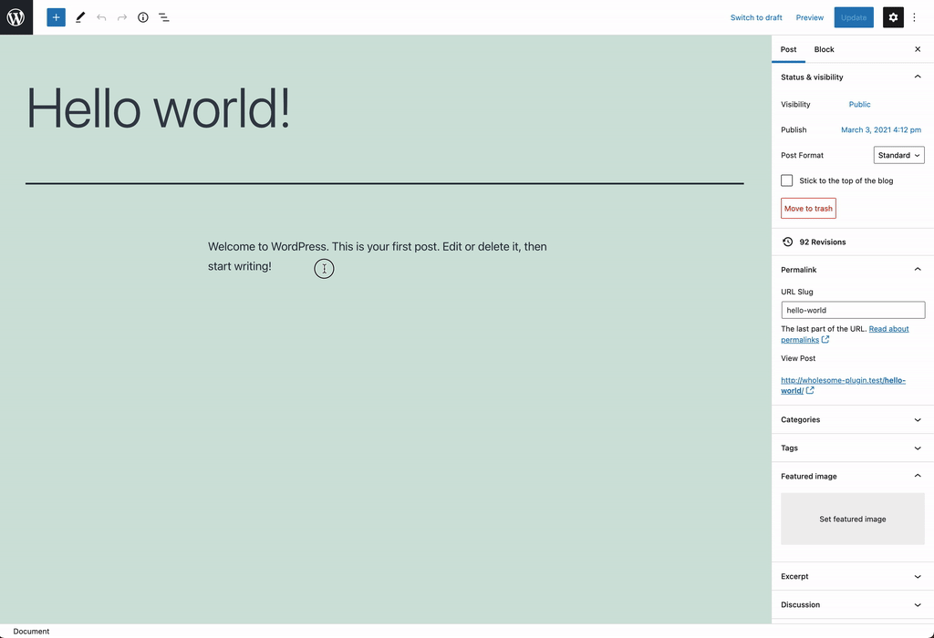
Using the Block
Putting it all together, let’s see the block in action:
Extra: Add Some More Fields
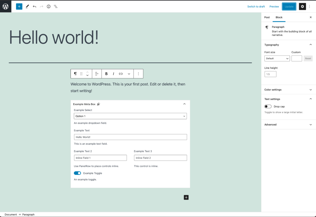
In the extra steps of the Custom Meta Box guide, we added in some extra fields. Let’s update the `Edit` method to include those same fields (note that I have omitted the hack):
import { __ } from '@wordpress/i18n';
import api from '@wordpress/api';
import { useBlockProps } from '@wordpress/block-editor';
import {
    Panel,
    PanelBody,
    PanelRow,
    Placeholder,
    SelectControl,
    Spinner,
    TextControl,
    ToggleControl,
} from '@wordpress/components';
import { select, subscribe } from '@wordpress/data';
import { Component } from '@wordpress/element';

import './editor.scss';

class OptionsExample extends Component {
    constructor() {
        super( ...arguments );
        this.state = {
        exampleSelect: '',
        exampleText: '',
        exampleText2: '',
        exampleText3: '',
        exampleToggle: false,
        isAPILoaded: false,
    };
}

componentDidMount() {

    subscribe( () => {
        const {
            exampleSelect,
            exampleText,
            exampleText2,
            exampleText3,
            exampleToggle,
        } = this.state;

        const isSavingPost = select('core/editor').isSavingPost();
        const isAutosavingPost = select('core/editor').isAutosavingPost();

        if ( isAutosavingPost ) {
            return;
        }

        if ( ! isSavingPost ) {
            return;
        }

        const settings = new api.models.Settings( {
            [ 'wholesomecode_wholesome_plugin_example_select' ]: exampleSelect,
            [ 'wholesomecode_wholesome_plugin_example_text' ]: exampleText,
            [ 'wholesomecode_wholesome_plugin_example_text_2' ]: exampleText2,
            [ 'wholesomecode_wholesome_plugin_example_text_3' ]: exampleText3,
            [ 'wholesomecode_wholesome_plugin_example_toggle' ]: exampleToggle,
        } );
        settings.save();
    });

    api.loadPromise.then( () => {
        this.settings = new api.models.Settings();

        const { isAPILoaded } = this.state;

        if ( isAPILoaded === false ) {
            this.settings.fetch().then( ( response ) => {
                this.setState( {
                    exampleSelect: response[ 'wholesomecode_wholesome_plugin_example_select' ],
                    exampleText: response[ 'wholesomecode_wholesome_plugin_example_text' ],
                    exampleText2: response[ 'wholesomecode_wholesome_plugin_example_text_2' ],
                    exampleText3: response[ 'wholesomecode_wholesome_plugin_example_text_3' ],
                    exampleToggle: Boolean( response[ 'wholesomecode_wholesome_plugin_example_toggle' ] ),
                    isAPILoaded: true,
                } );
            } );
        }
    } );
}

render() {
    const {
        exampleSelect,
        exampleText,
        exampleText2,
        exampleText3,
        exampleToggle,
        isAPILoaded,
    } = this.state;

    if ( ! isAPILoaded ) {
        return (
            <Placeholder>
                <Spinner />
            </Placeholder>
        );
    }

    return (
        <Panel>
            <PanelBody
                title={ __( 'Example Meta Box', 'wholesome-plugin' ) }
                icon="admin-plugins"
            >
                <SelectControl
                    help={ __( 'An example dropdown field.', 'wholesome-plugin' ) }
                    label={ __( 'Example Select', 'wholesome-plugin' ) }
                    onChange={ ( exampleSelect ) => this.setState( { exampleSelect } ) }
                    options={ [
                        {
                            label: __( 'Please Select...', 'wholesome-plugin' ),
                            value: '',
                        },
                        {
                            label: __( 'Option 1', 'wholesome-plugin' ),
                            value: 'option-1',
                        },
                        {
                            label: __( 'Option 2', 'wholesome-plugin' ),
                            value: 'option-2',
                        },
                    ] }
                    value={ exampleSelect }
                />
                <TextControl
                    help={ __( 'This is an example text field.', 'wholesome-plugin' ) }
                    label={ __( 'Example Text', 'wholesome-plugin' ) }
                    onChange={ ( exampleText ) => this.setState( { exampleText } ) }
                    value={ exampleText }
                />
                <PanelRow>
                    <TextControl
                        help={ __( 'Use PanelRow to place controls inline.', 'wholesome-plugin' ) }
                        label={ __( 'Example Text 2', 'wholesome-plugin' ) }
                        onChange={ ( exampleText2 ) => this.setState( { exampleText2 } ) }
                        value={ exampleText2 }
                    />
                    <TextControl
                        help={ __( 'This control is inline.', 'wholesome-plugin' ) }
                        label={ __( 'Example Text 3', 'wholesome-plugin' ) }
                        onChange={ ( exampleText3 ) => this.setState( { exampleText3 } ) }
                        value={ exampleText3 }
                    />
                </PanelRow>
                <ToggleControl
                    checked={ exampleToggle }
                    help={ __( 'An example toggle.', 'wholesome-plugin' ) }
                    label={ __( 'Example Toggle', 'wholesome-plugin' ) }
                    onChange={ ( exampleToggle ) => this.setState( { exampleToggle } ) }
                />
            </PanelBody>
        </Panel>
    )
}
}

export default function Edit( props ) {
    return (
        <div { ...useBlockProps() }>
        <OptionsExample {...props}/>
    );
}
Here is the outcome:
Extra: Taking it Further
- Have a look at creating [nested child blocks with the
InnerBlockscomponent - Have a look at using post meta fields in Gutenberg blocks
- Take a look at creating Custom Meta Boxes in Gutenberg